A little story – The birth of the ILO logo / Marc Carriche
Category : Centenary - Testimonials
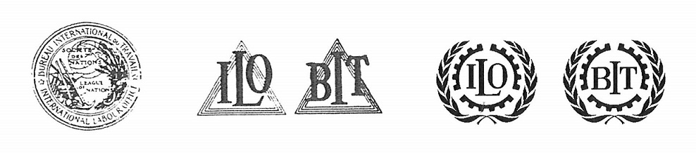
For decades, ILO publications were marked by a symbol that retirees will no doubt remember: two parallel triangles with the initials ILO and BIT. Not very aesthetic, but we weren’t at the stage where every institution had its symbolic logo. In the Public Information Branch, at least one among us felt the need for a new symbol as the 50th anniversary approached: Peter David, a specialist in what was then called “visual publicity”, began to study some models.
In 1968, when preparations for the anniversary were considerably advanced, one of our initiatives brought things to a head. The Universal Postal Union (UPU), which I had contacted, asked us for a design which might be proposed to its member States, to which it would suggest dedicating stamps in 1969. Imaginations began to churn.
Peter David and some external designers drew up numerous plans. It wasn’t a simple matter. The image had to say it all: the ILO, tripartism, work, peace, the UN connection – and what else? – I have forgotten. It was essential that the symbol was easily legible, agreeable to the eye, readily reproducible, and in only one colour. A tall order!
Dozens of designs
Each design presented some advantages and, of course, some problems. There were weeks of hesitation, discussions, thousands of pencil marks and brush strokes. Finally, we decided on three possibilities to present to the Director-General. He asked us to consult his staff. Confronted out of the blue with such a trivial, yet at the same time important, problem and not much bothered (this was 1968) by imperatives of “communication” (the word was not yet in fashion), each of the chiefs responded individually, spontaneously. I well remember the remarks of three of them on one or other of the designs: “Where is tripartism?”; “It looks like a pregnant woman.”; “This one resembles a funeral wreath.”
We had, of course, already collected, among many an approval, not a few critical observations by colleagues – from messengers to experts passing through. But, well, these remarks …
The whole process reminded us of the geographic and social diversity of this special organization called the ILO. We knew that the eye gets too used to novelties after a while and they become jaded. We had to have a pattern that would last the course, that wouldn’t become out of date too soon. We were working for the future. Peter and his designer wanted to search further but to change as little as possible. And that’s what they did.
So there were three new designs to show to the directorate – no question, of course, of taking a decision of this sort without endorsement from on high. But the Director at that time had other worries – many of them. Inevitably, the time arrived when the deadline fixed by the UPU was – the next day. We had to take a logo to Berne. What to do?
And the final choice
The whole process had been followed by a young official of the DG’s Cabinet – who, I believe has subsequently had a brilliant career in his country. In a last pow-wow between our Branch and him, everyone stood up to his responsibilities. We agreed on a model, adopted it and made it official without further ado. And I took the train to Berne. The UPU set to work with a success that surpassed our expectations.
Full speed ahead: folders, brochures, books, press releases, films, everything was marked with the new symbol, which was adopted quickly throughout the house. No objection was ever raised. It was all a great success.
May it continue for a long time to symbolize an ILO worthy and proud of its past, decisive and brave before its future challenges. – But that will be another story.